Psychology of Colours
Importance of colours in your branding choices.
A well written poem can make people swoon and a shocking image can infuriate people to react in different ways. But one of the lesser-known, but no less powerful ways to invoke emotion is simple, everyday colours. Did you know your surroundings may be influencing your emotions and state of mind? Do some places particularly irritate you? Or are some places especially relaxing and calming? Well, there’s a good chance that the colours in those spaces are the reason for this turmoil of emotions.
The psychology of colours is based on the mental and emotional effects colours have on individuals in all facets of life, personal such as choosing the wall paint for your room or curtains,as well as professional such as branding, design, web development or even office spaces for that matter.
In art therapy, colours are often related to a person’s emotions. Colours may also influence a person’s mental or physical state. For example, there are studies that show that some people who looked at the colour red, felt an increase in their heart rates, which in turn let to additional adrenaline being pumped into the bloodstream. Colours stimulate our brain, and from ancient times have proven to be a beneficial alternative psychotherapy. The Egyptians and Chinese used colours to heal, a process known as chromotherapy.
In a study titled “Impact of colour on marketing”, researchers found that up to 90% of snap judgments made about products can be based on colour alone, depending on the product. Colours convey meanings to consumers, in a way communicate with them subconsciously to either be attracted to the product or be averted from it. Hence, it is important to pay attention to the design and colours used in the packaging of a product, colours in the logo design, branding or even the walls of the office space of a company in order to increase productivity.
Another field where the prominence of colour psychology will apply is the internet. In a progressive time like now, wherein website development, app development and programming are essential for businesses to thrive, it is important to pay heed to what will set your business apart from competitors.
Considering all of the above, you might want to consider some of these suggestions about colors and how they might affect your emotions and mood:
Red:
Passionate, aggressive, important, excitement and urgency
As a dominating colour, red adds gravity and heightened awareness – quite literally, as the colour increases blood circulation, breathing rates, and metabolism. Red is a colour best used cautiously. Its ability for attracting attention makes it a precious tool for designers, but excessively it will inhibit relaxation.
Example: Many brands of fast food, such as McDonald’s, Pizza Hut and KFC, use red liberally in order to stand out in their branding.


Orange:
Playful, energetic and youthful
Orange has been called the most flamboyant colour known to man. Sharing red’s energizing traits, but to a safer degree, orange is a good way to add excitement to the design of a product without severity. It can even signify health, proposing vitality and vibrance.
Example: Fastrack uses orange in its logo design which is considered as young, edgy and cool.

Yellow:
Happy, friendly, optimism and warning
Yellow is a strange colour, it is often associated with happiness, but also activates the anxiety center of the brain. Like red and orange, it’s able to stimulate and vitalize – it’s the colour of warning signs and taxis – but use bright yellow cautiously because of the potential negative connotations.
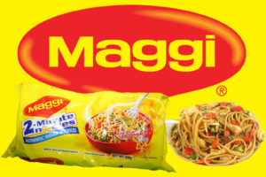
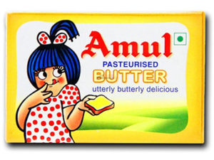
Example: Maggi Noodles (which makes kids happy) and Amul Butter (which makes kids and adults happy) are two examples of smart branding of products.
Green:
Natural, growth, money, health and fertility
Green mostly represents the environment and outdoors making it the clear choice to suggest nature and an organic quality. As the bridge between stimulating warm colours (red, orange, yellow) and calming cool colours (blue, purple), it is the most balanced of colours signifying stability.
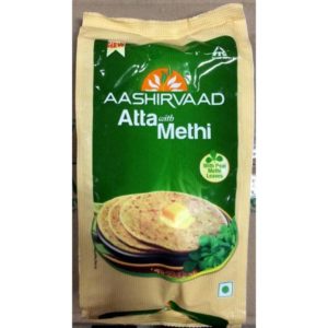
Example: Several brands of food products such as Safal and Aashirvaad include prominent green leaves in their brand logos.
Blue:
Serene, trustworthy and Iinviting
Blue is a commonly used colour because it is the colour of trust. Blue is the colour of calm and serenity, and as such encourages security and a feeling of safety. Blue is also incredibly versatile, light blue is the colour of water and the sky, so it generally has a refreshing and liberated feeling – even energizing if bright enough, but still retaining that reliable calm.
Example: Blue is a colour often used by banks like SBI, Canara Bank and HDFC. However the soothing effects also make blue a friendly and inviting colour, which explains its implementation by Facebook and Twitter in their website development.


Purple:
Luxurious, mysterious and romantic
Long associated with royalty, purple generates a feeling of luxury. Using a purple predominantly is a quick way to create a sense of elegance or charm. Lighter shades of purple bring to mind romance. Darker shades of purple add more mystery.
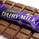
Example: The purple and gold packaging design of Cadbury is a technique to appeal to the consumer that this is chocolate royalty and it is the best among competitors.
Pink:
Feminine, young and innocent
Pink is a specialized colour that won’t work for a lot of products but will work perfectly with the right target audience. Because most people interpret people as feminine, the colour is quite widespread for targeting female users. It is also traditionally used with love and romantic themes, along with red and light purple.
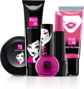
Example: Cosmetics like Elle 18 and Lotus utilize pink tones in their logo designs.
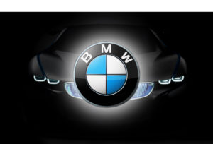
Black:
Powerful, sophisticated and edgy
Black being the strongest of all colours, it is often used only sparingly, such as for text but it works quite well as a primary colour element (like for backgrounds). Like purple, it emphasizes on sophistication, elegance and mystery.
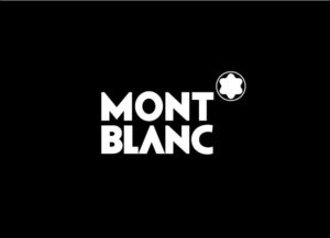
Example: Luxury brands which convey authority, such as BMW and Mont Blanc use black as their signature colour as a part of their branding.
FabCoders is a leading branding agency in Goa.Trust us to come up with the right branding for your business. Call us on 9545410696 or email on info@fabcoders.com to discuss your branding project.